IELTS Toolkit: Writing Skills - Planning an Academic Report
Planning a Task 1 Academic Writing Answer
When you only have 20 minutes to read the question, interpret the information, select the most significant details and write your answer, the key to success is PLANNING!
This toolbox exercise will give you different ideas and techniques about how to plan your answer effectively.
First of all, let’s look at a sample chart and graph from a Task 1 question.
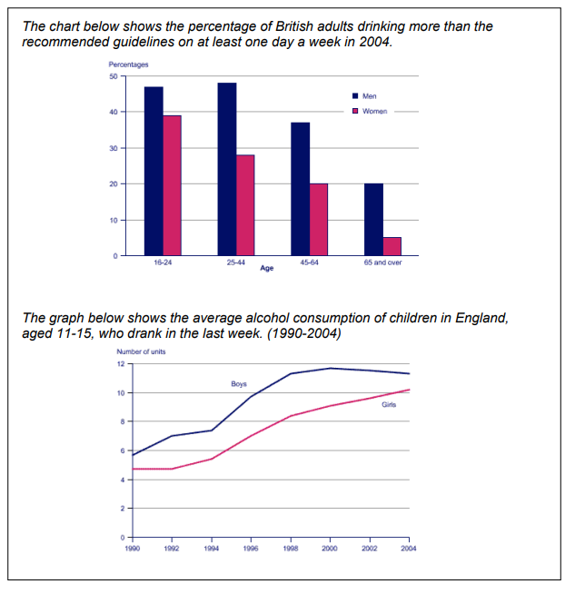
TOP TIP – Make sure you read and understand ALL the information presented in the graphs and charts.
STEP ONE
When there is more than one graph or chart to look at, it seems that the task is even more difficult. Therefore the first thing to do is to see what the two diagrams have in common.
- both charts show alcohol consumption in Britain
- both show the difference between the two sexes
- both show that boys/men drink more alcohol than girls/women
STEP TWO
And then look to see what is different between them.
- the 1st chart shows percentages and age groups
- the 2nd graph shows number of units and years (1990 - 2004)
- the 1st chart compares male/female adults in Britain
- the 2nd graph compares boys and girls in England aged 11-15
- the 1st chart shows how many adults drank too much at least one daya week in 2004
- the 2nd graph shows the number of units the children drank in one week
This information can be briefly described in your introduction.
Example Introduction
Both charts show the levels of alcohol consumption in children and adults in Britain. The first chart shows the difference in percentages between men and women in 2004 and the second graph displays the number of units drank by girls and boys between 1990 and 2004.
STEP THREE
Because the information presented in the two charts is quite different it is better to describe them separately in two distinct paragraphs.
TOP TIP – Make a quick paragraph plan – brief notes for each paragraph
You need to decide quickly which information to include in your report. Look for the statistics that show the most interesting results and the clearest trends.
PARAGRAPH ONE (first chart)
- in each age group men drank more than women
- nearly half of all men aged 18 - 44 exceeded the recommended amount
- nearly twice as many men as women between 25-64 drank more than the recommended amount
- almost half as many women aged 45-64 (20%) exceeded the recommended
- amount compared to the 18-24 age group (39%)
TOP TIP – Include a variety of statistics and numerical expressions
Example Paragraph
The first chart shows that nearly half of all men between 18-44 exceeded the recommended daily amount. Although the figure was also quite high for women aged 18- 24 (39%), the figures for those between 25-64 were approximately half the number of their male counterparts. Moreover, the percentage of women over 65 reduced dramatically to only 5% compared to 20% of men
PARAGRAPH TWO (second graph)
- boys drink more than girls but BOTH have increased since 1990
- between 1994 and 1998 there was a significant increase in both sexes
- the number of units consumed by girls more than doubled between 1990 and 2004
- the number of units has decreased for boys since 2000
- the gap between boys and girls is getting narrower
TOP TIP – Think about the correct verb tense you need to use
Example Paragraph
The second chart shows that there was a significant increase in the alcohol consumption of both boys and girls between 1990 and 2004. In fact, the number of units consumed roughly doubled for both sexes with the most dramatic increase occurring between 1994 and 1998, rising to over 11 and 8 units for boys and girls respectively. Since 2000 the figure has slightly fallen for boys but for girls it has continued to rise, reaching a peak of just over 10 units in 2004.
STEP FOUR
Is there an obvious connection between the two charts? Do they reveal a changing trend? Can you draw any overall conclusions from both charts?
- the highest percentage of female drinkers are aged between 18-24
- the number of young girls is significantly increasing
Use this information to write a concluding sentence.
Example Conclusion
Both charts reveal particularly worrying statistics in the alcohol consumption of girls and young women.
TOP TIP – use relevant linking words to make your report easier to read.
The following exercises help you to focus on the type of language you need to use in a report.